Colour is so omnipresent today that we need not worry about having to create it or search for it extensively…in fact, a main concern is rather knowing how not to use too much of it at a time. As a digital artist I can simply open Photoshop and slide a colour wheel around to obtain thousands of different colour swatches that anyone else can use. As a traditional artist I can shop around for the exact shade of red I need. Being able to access and experience these colours is taken entirely for granted as an artist and as a viewer.
For this reason, the National Gallery’s exhibition Making Colour is a perfect reminder in our saturated world of the ways in which artists have long struggled to find and make colour in order to represent their particular vision of the world. The record of this search is as vast as it is fascinating; artists up until the 19th century were still grinding colour pigments and mixing them in with egg white, yolks or oil in order to create the effects they desired. The creation of synthetic colours available in tubes then allowed for revolutionary changes as painting outside was possible. As Renoir famously points out: “Paints in tubes allowed us to work in nature… Without paint in tubes, there would have been no Cezanne, no Monet, no Sisley or Pissarro, nothing of what the journalists were to call impressionism.” Yet this chemical and artistic breakthrough could only have been achieved through a slow and painstaking historical process to find the perfect pigment in nature, whether it was through dried insects, plants, minerals….or even poison.
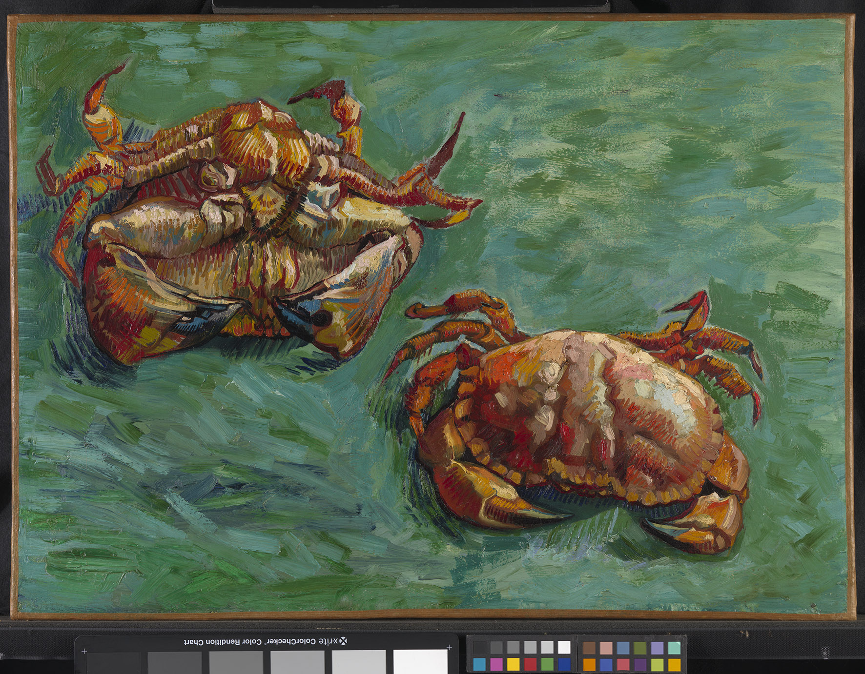
A short introduction shows us various colour palettes and the way in which the perception of colour evolved throughout the centuries, culminating into optical theories about light being broken down into a vast spectrum of colours. They also show us a few basic yet useful example about complementary and contrasting colours, as well as the way in which painters’ techniques of colour application varied, such as the use of orange and green with Van Gogh’s Two Crabs. Vigée-Lebrun’s neat dabs of colour in her self-portrait are challenged by Turner’s seemingly chaotic palette, showing that their brushstrokes and mixtures as well as the colours they had access to definitely influenced their styles and stemmed from their personalities.
The following rooms are all thematic in nature rather than chronological, presenting a wide selection of works from all time periods, with one colour for each room, the dark walls and soft lighting allowing the works’ palettes to shine out to their audience. Whether it is blue, red or green, even veering onto silver and gold, each section retraces a short history of the way in which its colour was created and used on a variety of formats. The act of breaking up the discovery of colour into several sub-sections and giving them their own small history, creates a sense of harmony and casualness; I could wander from room to room without feeling as though I had to follow a specific route or chronology. The exhibition was relatively busy but never gave a sense of clutter or overcrowding, mainly because it was quite easy to wander around from object to object leisurely rather than awkwardly queue up to see a series of works in a row.

I was slightly wary about the sheer amount of information that would be thrown at me for every single colour. The ways in which we perceive colours now is almost never relevant to the art work’s actual time period, and cannot be properly be understood without a long painstaking history of each colour. Would it prove too heavy and too much to handle for an exhibition? It soon turned out, however, that this was going to be an extremely technical take on colour based more on aesthetic sensation, contrast and form and the ways to acheive it on various mediums.
The amount of cultural, religious, social and historical complexities and significance around blue, from the mantle of the Virgin Mary to its presence on the EU flag, would be so large and shifting in itself that the colour would need its own exhibition. (Incidentally it does possess its own book, Blue: History of a Colour by the colour historian Michel Pastoureau, which I cannot recommend enough). Although each section did briefly recall the various ideas related to their respective colours (red for passion or purple for nobility), the focus was less on their symbolism or what they represented, and more focused on how they were found and used, as well as their value. Ultramarine, created with lapis lazuli, was defined in its economic value and importance in the fact that it came from “beyond the sea”, mined in Afghanistan to this day in very difficult conditions. Its intensity and long-lasting nature made it precious for artists and their patrons from the medieval period onwards, but also explains why and how cheaper alternatives were looked for in duller and darker pigments such as smalt, or in an easier form through cobalt blue, later on used in its synthetic form by Monet. From this we could of course interpret that blue was researched and paid for because of its religious importance or that on the contrary it became an important colour used for the best of religious art because of its worth. Yet focusing mainly on the purely visual and technical was a good choice: sometimes leaving one aspect out from an immense subject allows another facet to shine in a more coherent and interesting manner and this was definitely the case!

Each artwork description made sure to make the viewer understand exactly which pigments the artist used and how, sometimes adding in some historical context to reinforce its point but focusing on the form rather than the subject itself. In a sense, understanding the colour of the painting gives us valuable tools to understand it on our own terms, without the need to know the story behind it or the particular symbolism of a colour at that given time. For example I was not given much in the way of context concerning the Portrait of a Lady by Moroni and the sitter’s role or social status, but the knowledge that the red and gold dress she was wearing would have never existed because it was too expensive to make in 16th century Italy told me a lot about the wealth and power associated these two colours in terms of image and status.

In the same way, The Beheading of St-Margaret by Gherardo di Jacopo Starnina did not inform me about her martyrdom and its significance but rather about the narrative power of colour as our eyes move from the purple of the executioner to her form shrouded in blue against the dark background and crimson city walls.

A great deal is also learnt about what we can no longer see or understand, due to the fact that either colours or our perception of them has been changed, either physically or psychologically. For instance, in Masaccio’s Saints Jerome and John the Baptist, while one red (vermillion) has remained vibrant in the other (red lake, considerably cheaper, made with crushed dried insects or bark) has faded away, showing the stark difference between one and the other in terms of quality and durability.

In the same sense, the use of gilding is described as something that would have a lot more power for the Renaissance viewer by candlelight due to the flickering of the surface making it seem more tridimensional, while our electric light makes it flat and dull. In the same vein, flesh was painted with a greenish base to give it more volume but now that the flesh colour has faded away we see these painted figures as far more sickly than they actually were! These are only a few of the little tidbits of information and detail that made the exhibition so fun and refreshing, veering away from what we usually focus on in such paintings.
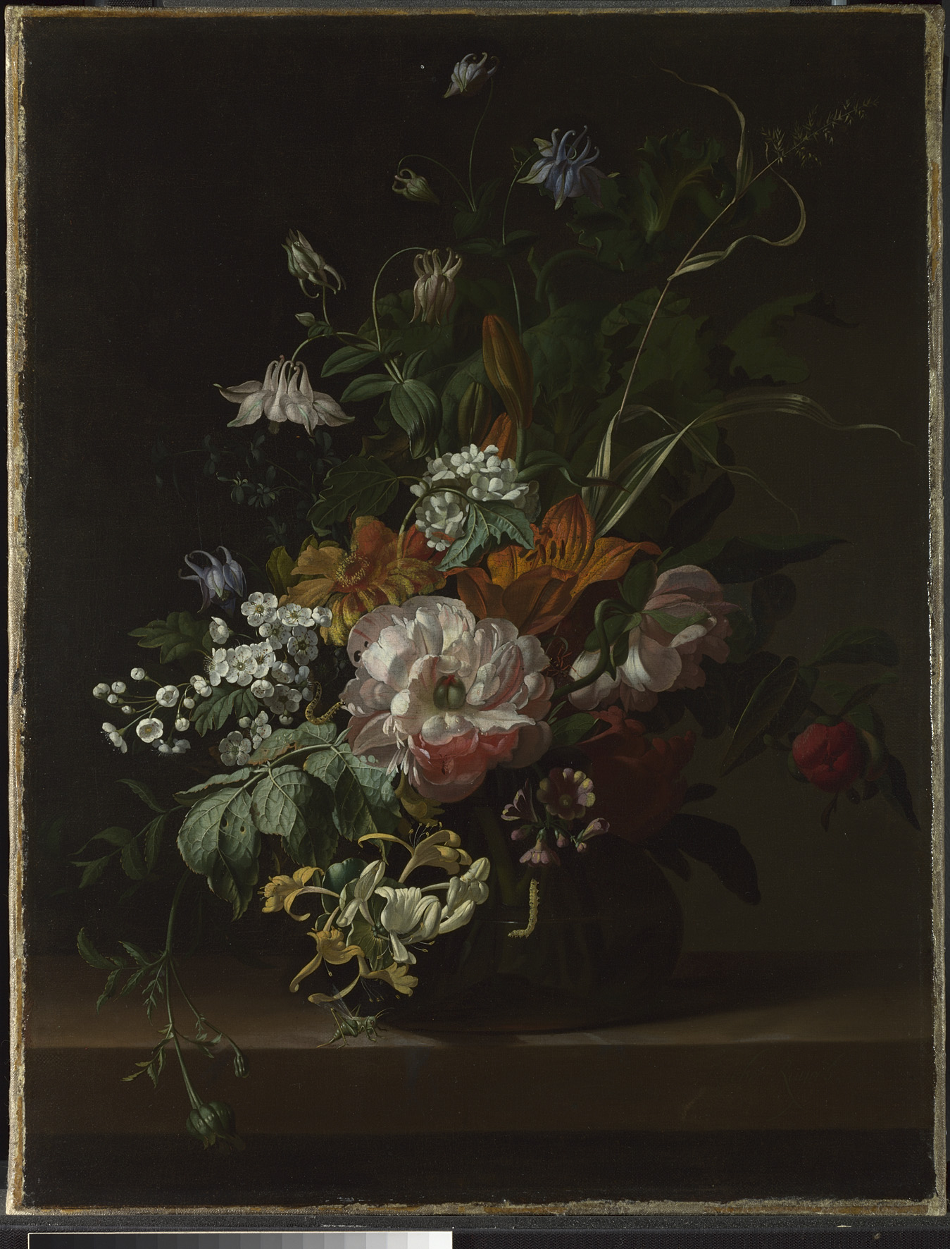
The visual impact of the pigment’s source versus the final work is often visually striking and makes for an informative and aesthetic experience. Seeing lapis lazuli evolve in a small display from its original rock, into pigment and then eventually object, breaks down colour from elaborate artwork to simple component in a way that mingled art history with science in an effective and pedagogical way. Another example is the delicate still life painting by Ruysch, just beneath an orange mineral in a glass display. The comparison seems slightly underwhelming until we read that the mineral in question contains arsenic, making its use very scarce amongst painters. Rachel Ruysch, however, was one of the foolhardy artists so intent upon using orange for her flowers that she took the risk…a risk that evidently paid off.
The clear and concise information and descriptions are complemented by videos that show exactly how the artists mixed these pigments and then used them; several show the different effects of pigments mixed with egg yolk or oil, the first creating an opaque, fast-drying tempera and the second allowing for a more translucent glaze ideal for multiple layers. The final room even shows the careful process of gilding, in a reconstruction by students of the Hamilton Kerr Institute in Cambridge and the National Gallery Conservation Department.
I feel that in terms of variety and presentation the exhibition did remain extremely centred around Western European paintings from early Renaissance to the early 20th century; although some variety was provided in time period or format, I would have been glad to see more diversity. However, this can be explained by the fact that the main curators of the exhibition are Caroline Campbell, Curator of Italian Paintings before 1500 at the National Gallery, and Ashok Roy, Director of Collections at the National Gallery: where their expertise and choice is obviously tied to their own tastes, knowledge and collection. This is also reinforced by the fact that most of the scienfic observations about pigments and their application is born from the microscopic study of the fragments of paint on the dedge of canvases: it is therefore logical to keep the range of works presented to those that can be most effectively studied (for example, the work beneath, Degas’ Combing the Hair, was studied using a fragment of paint made into a cross section and then observed under a microscope to discern its different red pigments).

This crucial aspect is actually shown to us through the final part of the exhibition, a short film showing us the scientific study of colour, and the way in which the colours of the past and their uses are rediscovered. It also allows us to partake into small experiments around our own perception of colour, which will be assembled into data for a survey, advancing the research the exhibition showcased in a different light. It gave a sense of interactivity and involvement as well as a definite sense of ambiguity surrounding colour and its interpretation, either optical or psychological.
This exhibition was a perfect example of the way in which a large and extremely technical subject could be broken down into a simple yet intelligent way for a diverse audience to understand and appreciate further the use of colour. It definitely felt as though this was an exhibition in which definite new skills and visual tools could be acquired and then applied to paintings beyond the exhibition’s walls, in the National Gallery and elsewhere. Highlighting the expertise of both artists and the scientists dechiphering their works’ colour, it did not clutter itself with additional historical context, leaving the colours speak for themselves and letting us appeal to our own senses and artistic taste. Like a few primary colours creating a large variety of tones, I think that a simple yet intense exhibition such as Making Colour will be able to provoke different interpretations and ways of seeing in its wake.

Making Colour, at the National Gallery, from the 18th of June to the 7th of September
–
Did you see the exhibition? Want to talk about colour and its history? Do you think there are better ways of talking about colour? Feel free to speak up here, on the new Facebook page or on Twitter!

Leave a comment